Valentine’s Day Landing Page Design Process
The Valentine’s Day landing page was designed to inspire customers while balancing clarity and commercial goals. I began with wireframes that explored multiple layout options for highlighting the meal deal, hero products and offers, then iterated through visual concepts using gradients, typography, and campaign messaging. Each iteration tested how well the content hierarchy, legibility, and toolkit application worked together. The final design combined the strongest elements to deliver a cohesive, engaging, and accessible customer journey.
Wireframes
I mapped two routes for the Valentine’s Day landing page based on the trading team's requirements. Both featured a consistent hero, SEO title, and pods calling out Valentine’s Day related offers, with variations in how the meal deal and hero product pods were formatted for clarity and impact.
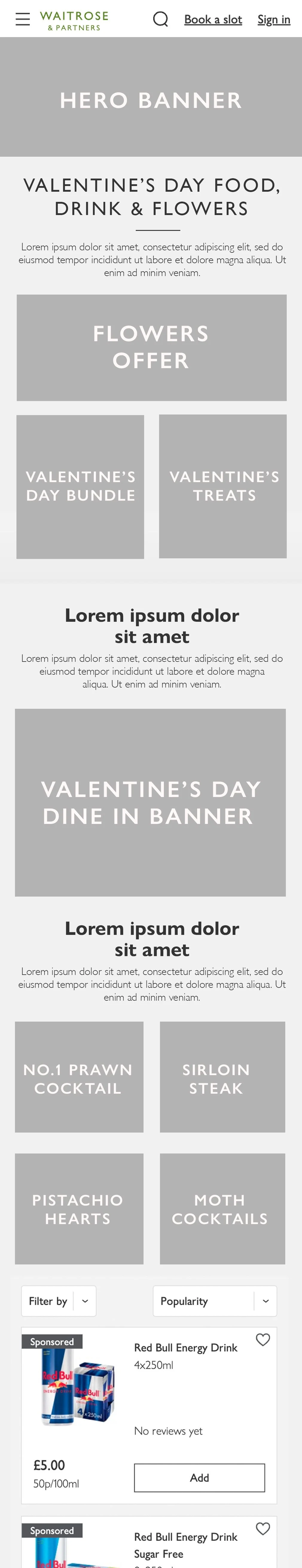
Chose wireframe one, as combining the meal deal banner with four product pods risked visual overload. This approach ensured a clearer, more digestible layout that helped maintain focus while still highlighting the campaign’s key offers.

1.0 Full-width Valentine’s Day meal deal Banner


2.0 Valentine’s Day meal deal and 4 hero products share the same section
Landing page Iterations
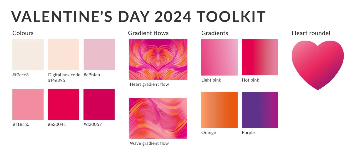
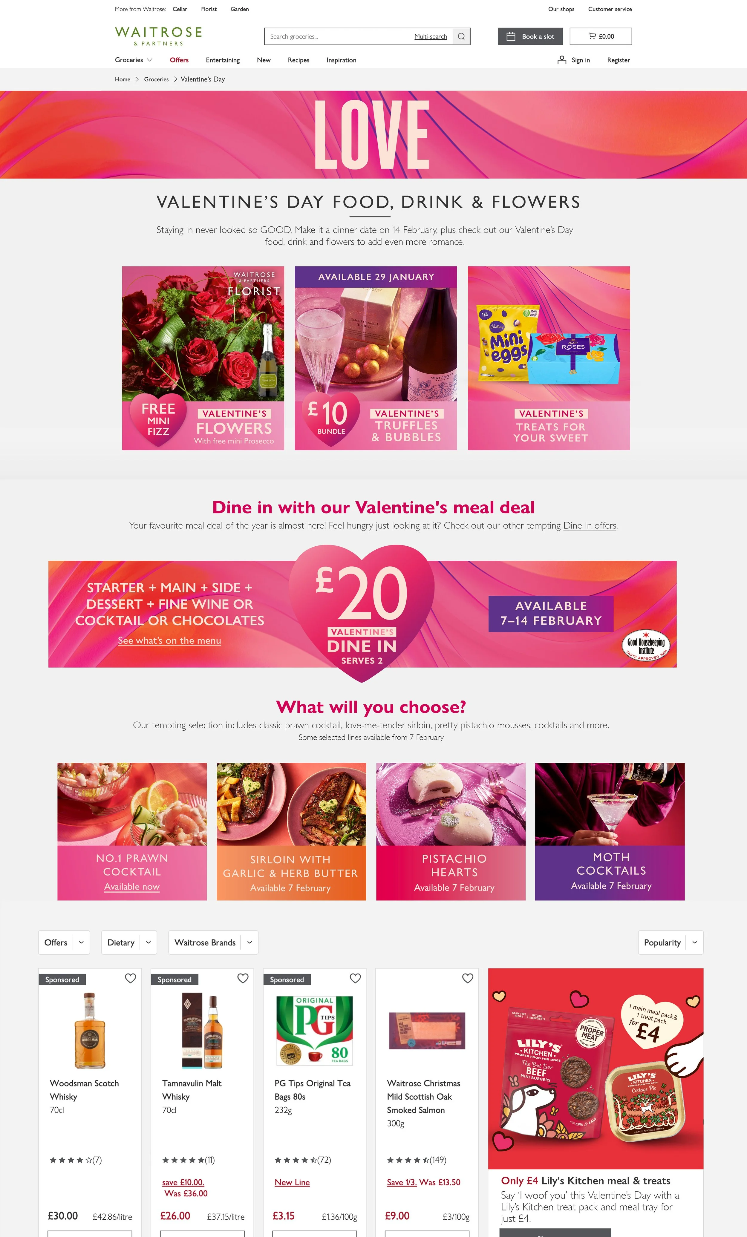
1.1 Explored a literal angle of Valentine’s day theme using “Love” in the hero banner and a heart gradient flow. Applied gradients across sections for cohesion and used a greyed-out meal deal banner to visually communicate availability (as the landing page went live before the meal deal).

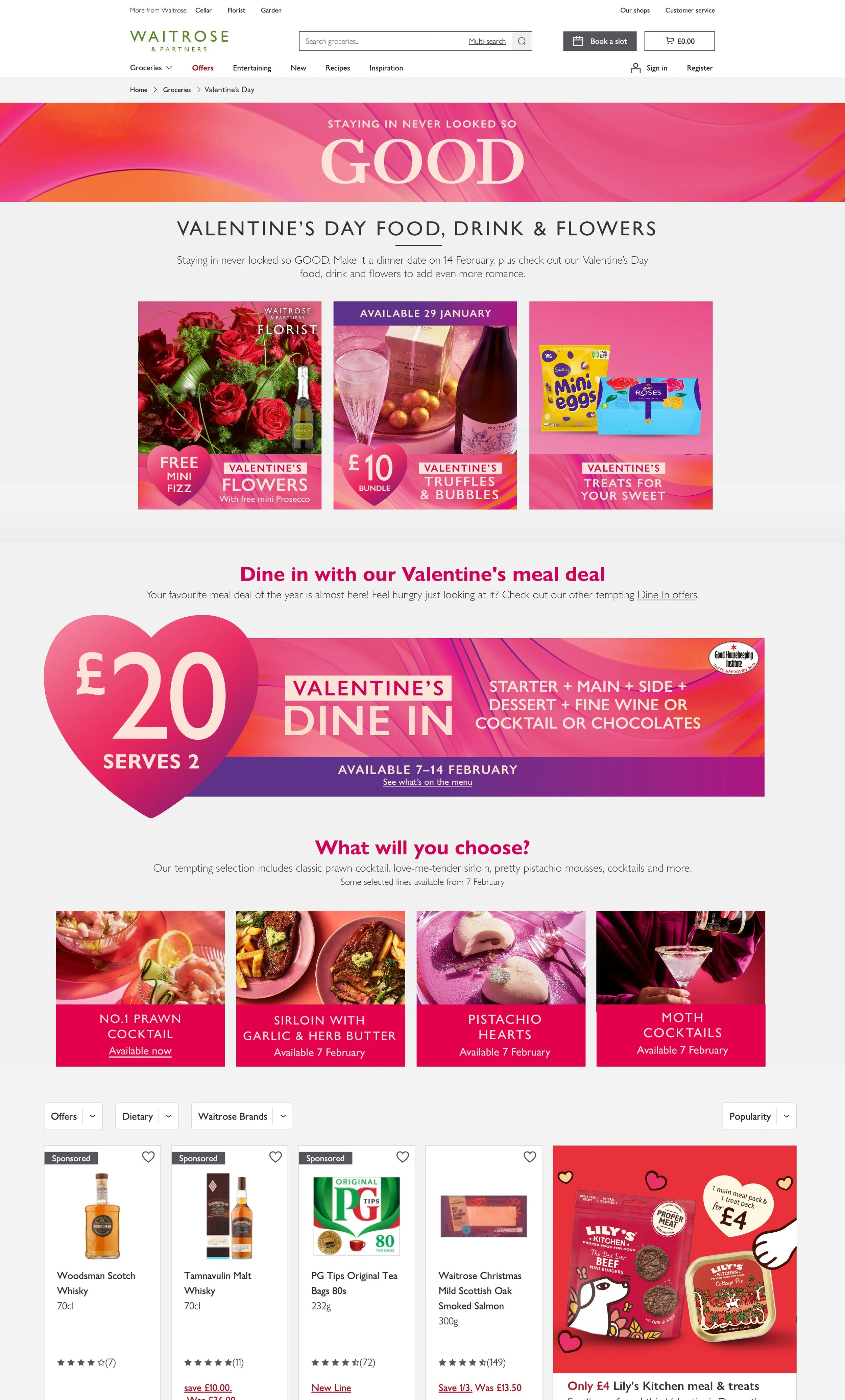
1.2 Introduced a wave design in the hero banner for better scalability and reduced content overload by removing imagery from the meal deal banner. Not using imagery made the page look less busy, and the heart in the middle of the banner with copy on both sides allows users to focus on the messaging being conveyed. Differentiated hero product with unique gradients, creating distinction while streamlining visual impact.
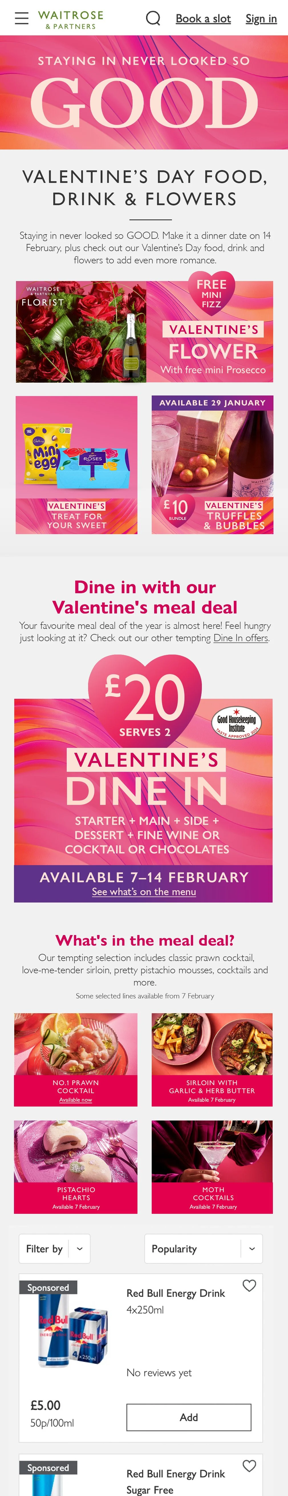
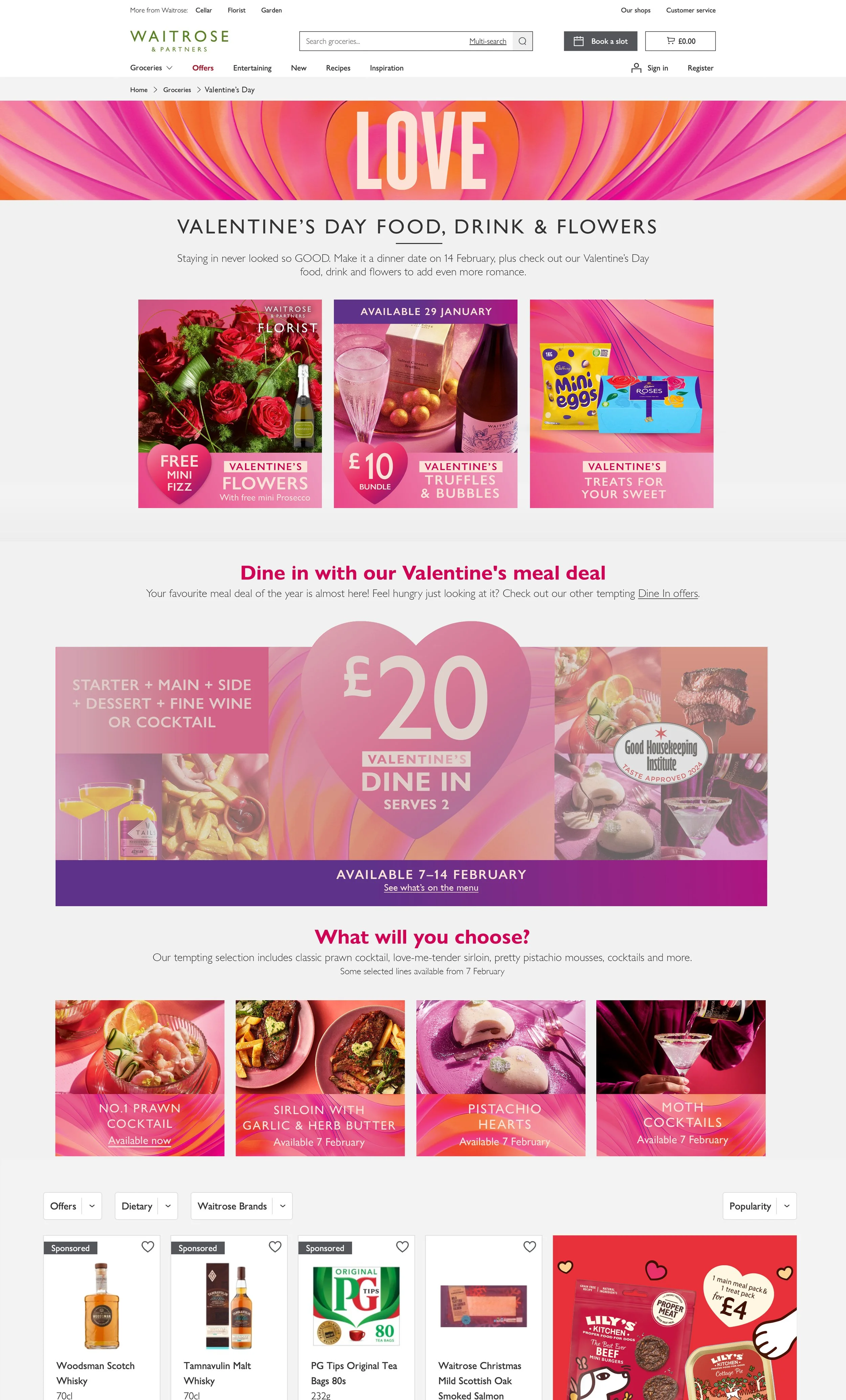
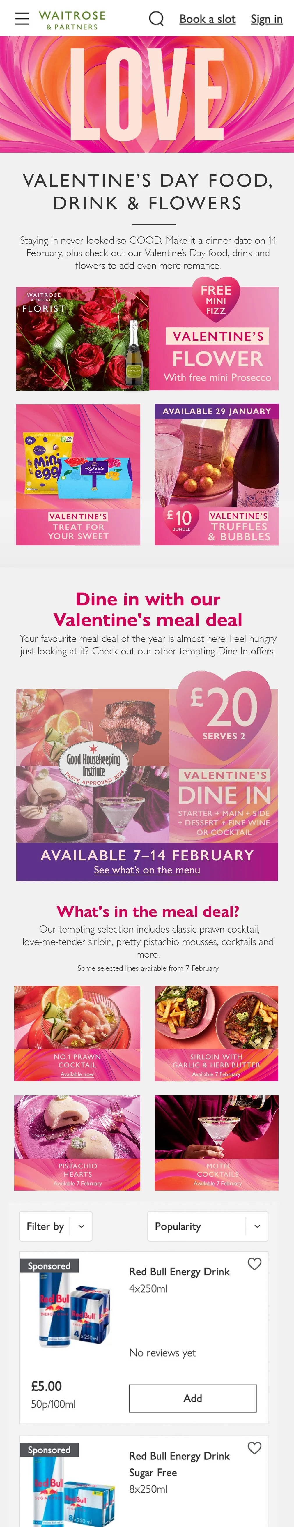
1.3 Shifted to a campaign lockup message, “Staying in never looked so good,” in the hero banner to encourage customers to shop for an affordable and high-quality meal deal. Smoother transitions across sections in this design due to the gradient flow being used in two-thirds of the design. Increased text size in the banner improved legibility.


Final Outcome
Combined the best elements of earlier versions: the wave gradient and campaign lockup from 1.3, clearer copy from the dine-in banner, and distinctive hero pods from 1.2. This created a cohesive, user-friendly design aligned with the campaign toolkit.