Valentine’s Day Email Iterations
The Valentine’s Day email was the first to use the newly developed modular template, setting the foundation for a scalable and consistent email design system. I contributed to both the system’s development and the final design, balancing creativity and functionality. By integrating the seasonal toolkit and refining layout, colour, and accessibility, the final design delivered a visually engaging and user-friendly experience that shaped future campaign emails.

Wireframes
2023 Email Designs
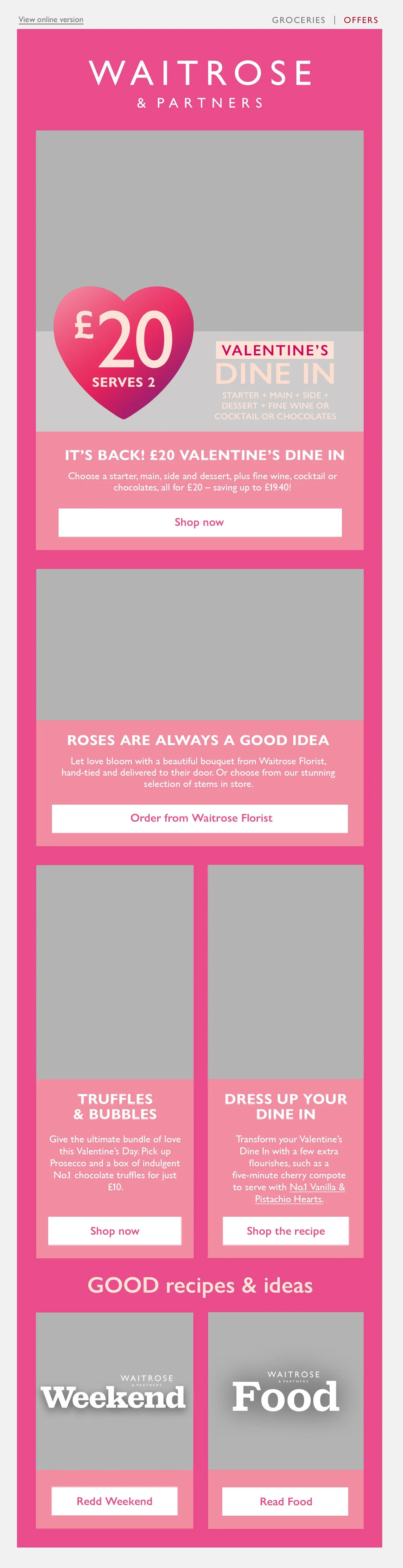
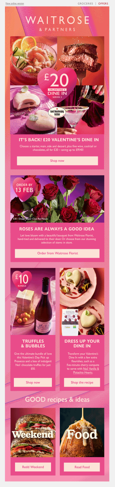
This is the Valentine’s Day email that was deployed as a part of last year’s campaign, created by a colleague leading the campaign. It followed the conservative, editorial style of Waitrose’s Inspiration emails, which aimed to drive traffic through inspiring content. However, a shift in commercial goals placed greater emphasis on promoting campaign shelves and hero products, creating the need for a bolder, more impactful design approach.


1.0 In the email redesign, we transformed the understated look of the previous email into a more contemporary design by using bolder elements and sectioning information to create a clearer distinction between promotional items.
For this email, I outlined the structure of the email based on CRM’s promotional requirements, highlighting the meal deal in the hero, flowers, and a truffle bundle, followed by the magazine publications.
Mid-Fidelity Designs

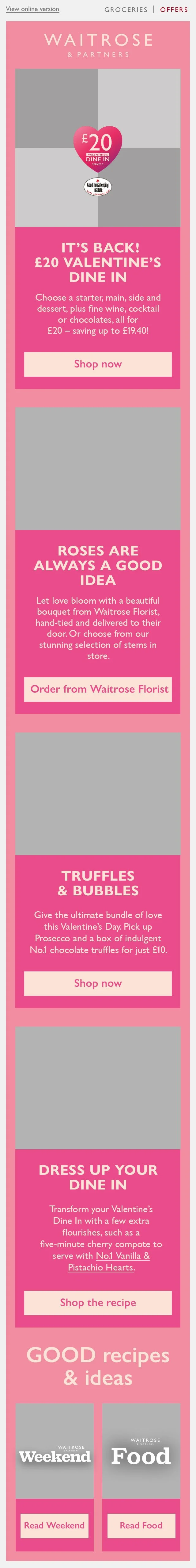
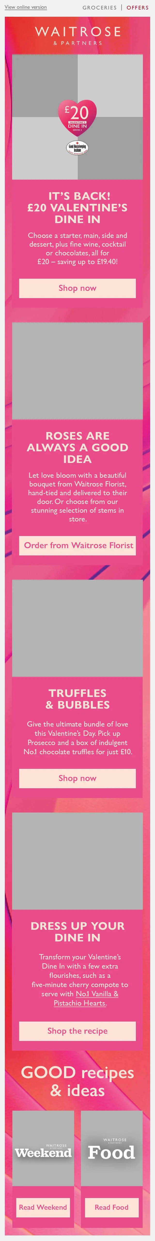
1.1 Tested a bold pink background with a group shot hero. While eye-catching, accessibility issues arose with text contrast, limiting the toolkit’s use. The design lacked flexibility and fell short of accessibility standards, so it was not pursued further.
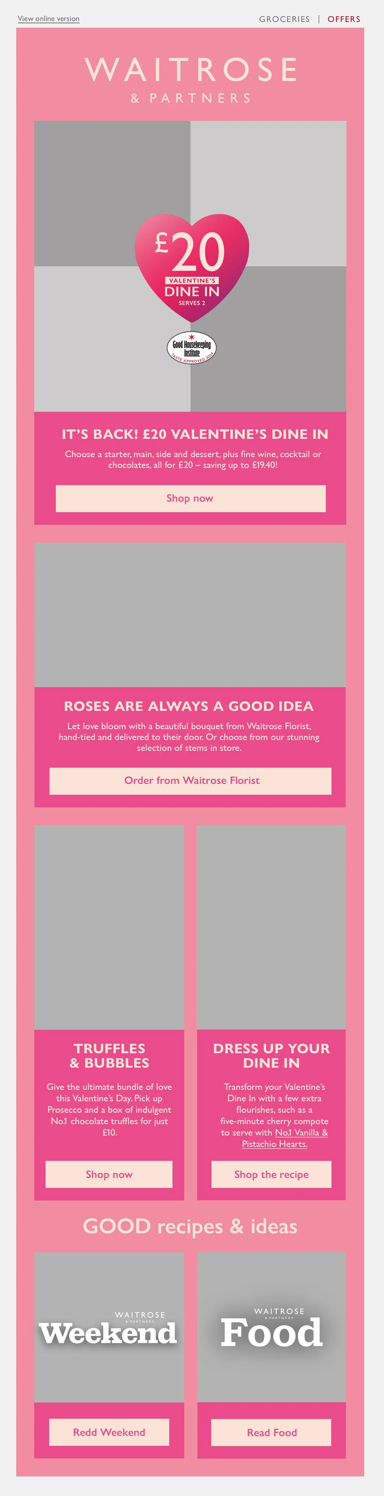
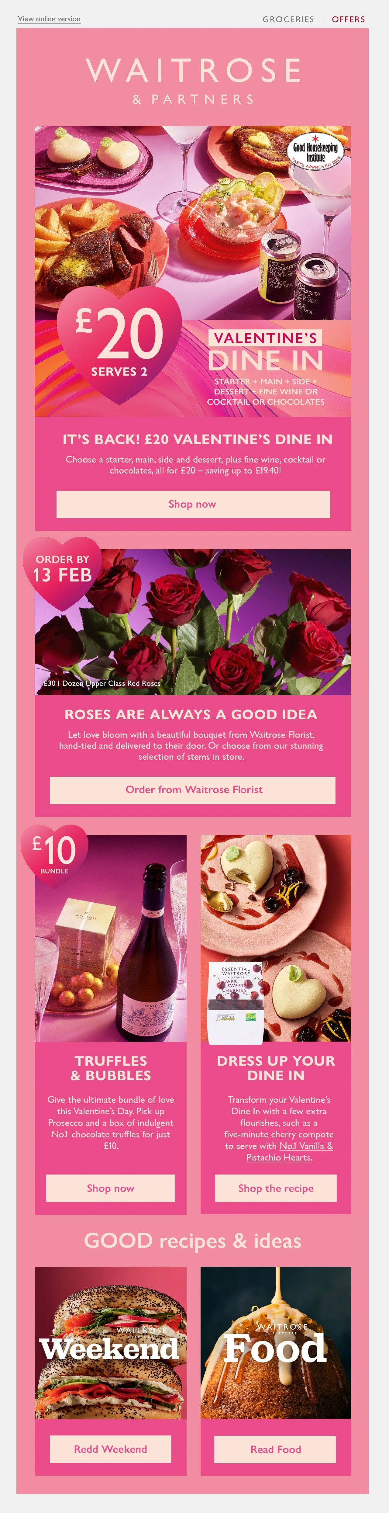
1.2 Reversed the colours in design 1.1 by having light pink backgrounds and bold pink copy blocks for better text contrast and toolkit alignment. Introduced a grid format for the hero, which features individual products, creating a clear and accessible design consistent with digital and in-store assets.
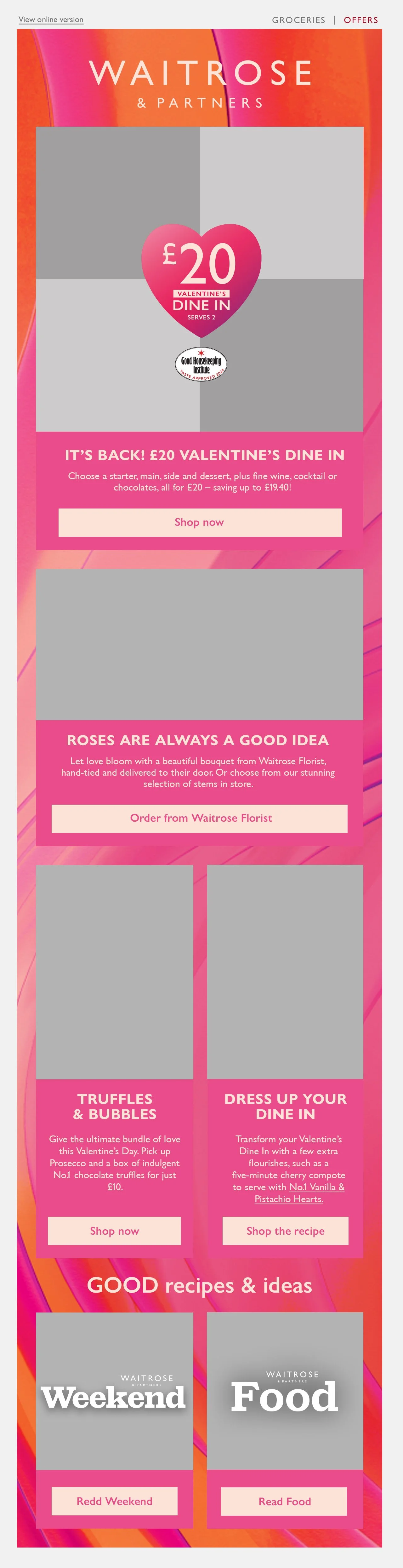
1.3 Extended toolkit integration with a wave gradient background. The wave proved more effective than the heart shape gradient, which became obscured by content. The wave gradient flow worked better as it was more visible when used at this scale.
High-Fidelity Designs
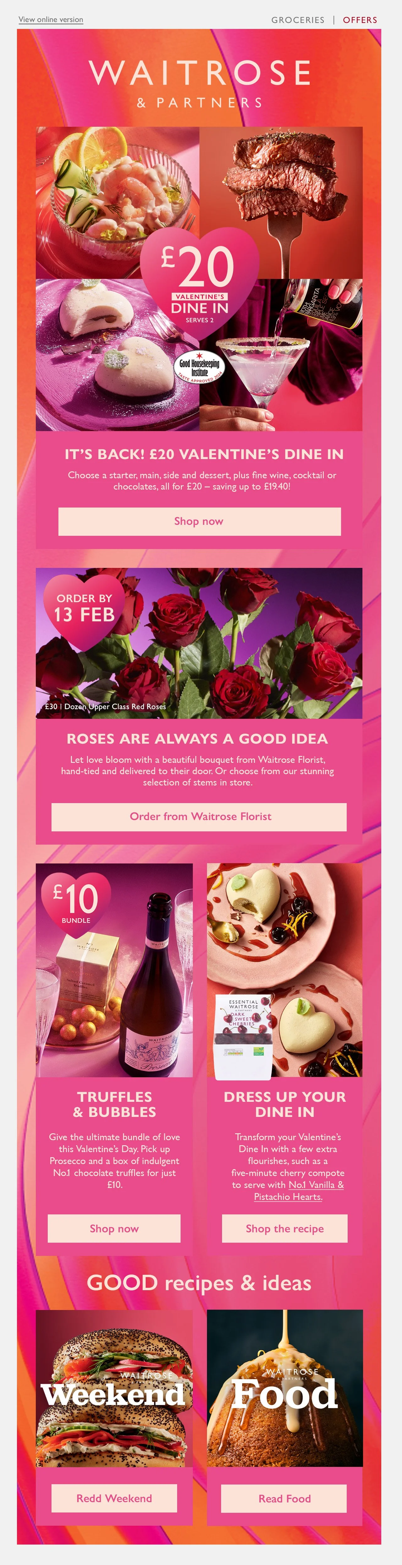
1.2.1 Explored an in-store inspired layout by using the group-shot imagery in the hero. However, the combination of multiple elements in the hero section made the email overwhelming, risking reduced engagement. The heart roundels popping out of the pods made the offers stand out slightly from the imagery.
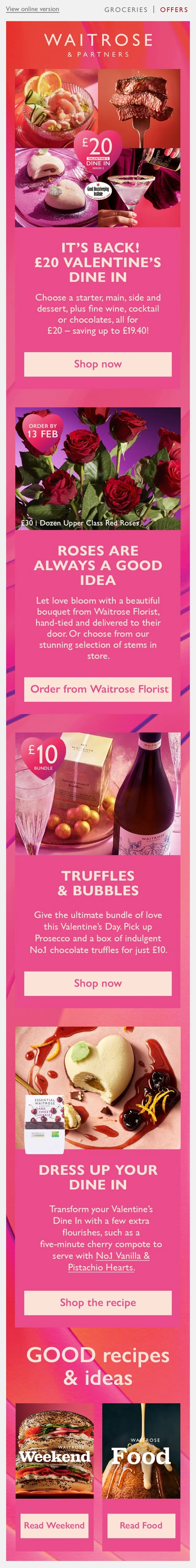
1.3.1 Grid format for the hero was retained to spotlight individual products, with roundels embedded inside imagery to avoid them from blending into the background. However, the bold gradient flow background clashed with content, creating overstimulation that distracted from key messaging and reduced clarity.
Final Outcome
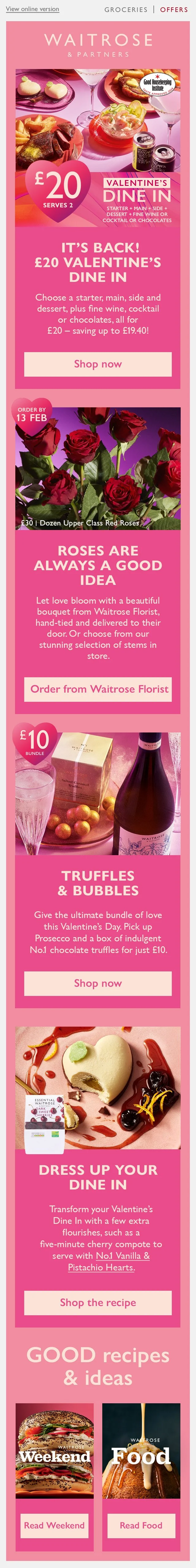
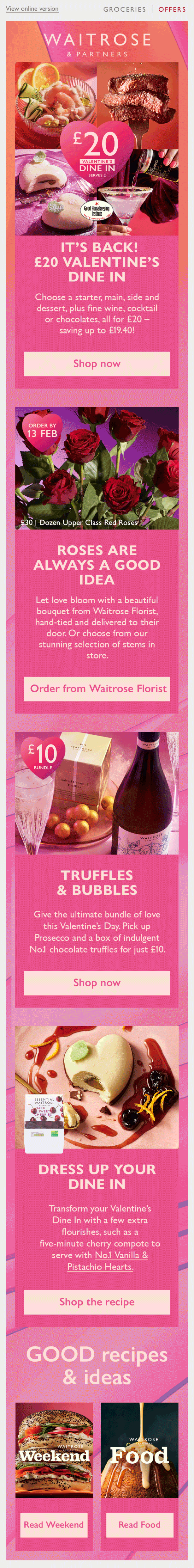
Although the gradient flow background didn’t work in the previous design, I was keen to solve the issue as I liked how it aligned the most with the seasonal campaign toolkit, creating a consistent visual journey in-store and online. The background was refined by softening the opacity and integrating it subtly in the header and outro. Motion was added in the hero through the use of a GIF, which showcased product variety, enhancing engagement and campaign consistency.
The redesigned Valentine’s Day email set the visual direction for future campaign emails, introducing a scalable design approach that remains in use today with minor refinements. My contribution helped create a durable template that became the foundation for future designs. I’ve since supported its evolution by continuing to stress-test new layouts within the design system, ensuring it stays adaptable and effective. The email ranked as the third top-performing campaign of the year, achieving a 3.95% engagement rate, surpassing the 2.64% benchmark.