Easter 2025 Landing Page Iterations
Easter is one of Waitrose’s biggest seasonal moments, with high visibility online and in-store. My role was to design a landing page that not only celebrated the festive theme but also guided users seamlessly from inspiration to purchase. This section of my portfolio focuses on the iterations I explored during the design process of the Easter Landing page, from initial concepts to the final data-informed solution. These iterations demonstrate how different design directions were tested, refined, and aligned with both user needs and commercial goals.
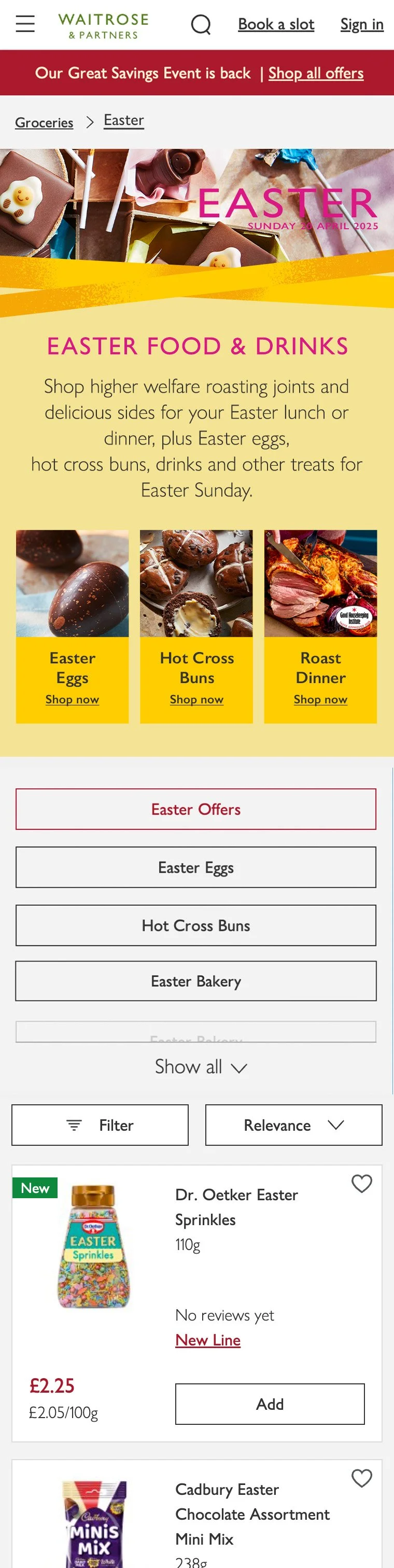
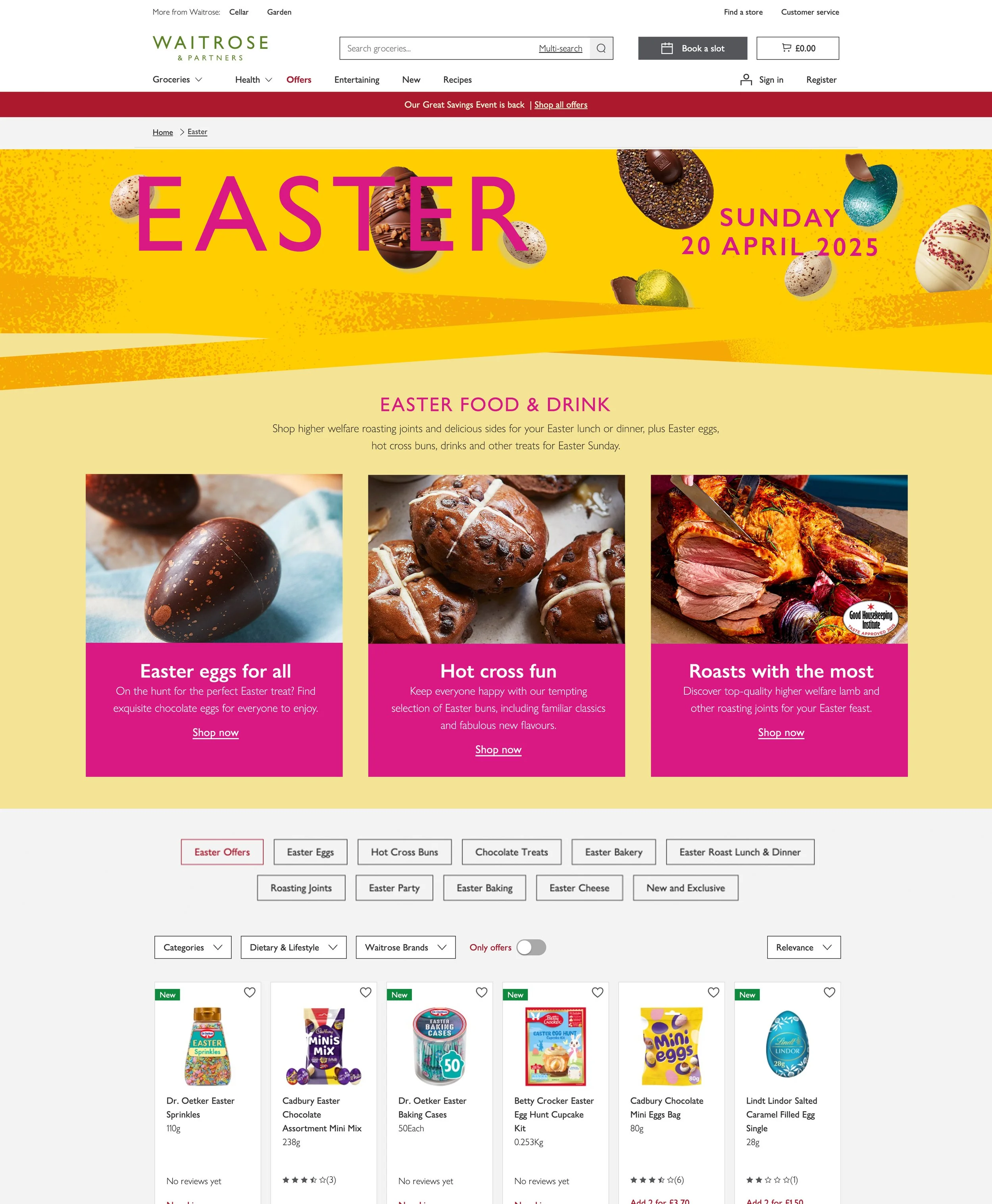
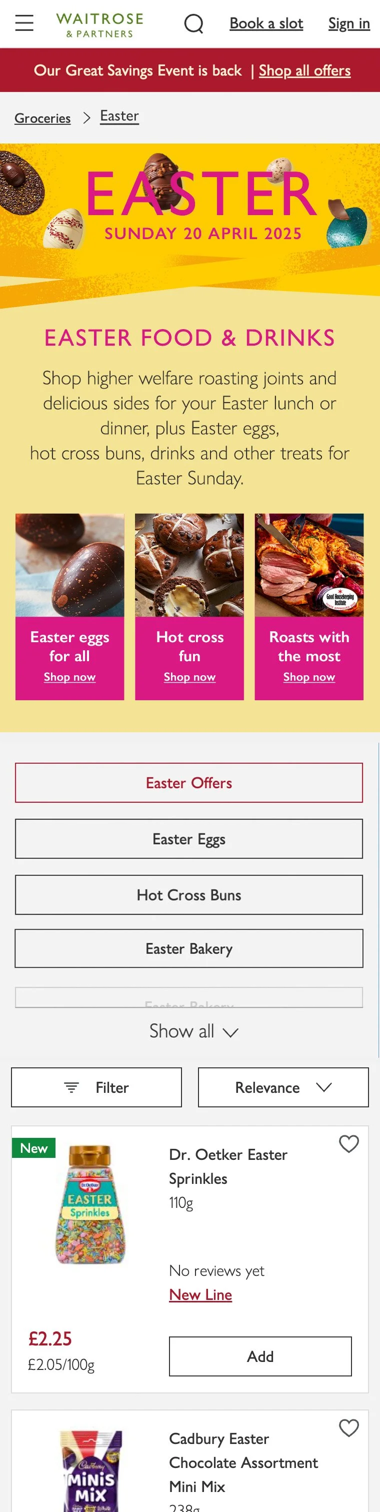
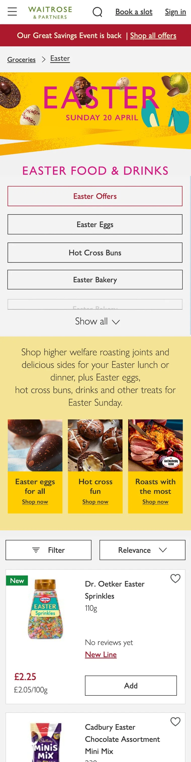
The wireframe was shaped by requirements from the trading team, who briefed the need for a hero banner, three pods highlighting the main Easter categories, and navigation buttons to help customers quickly reach specific browse aisles.
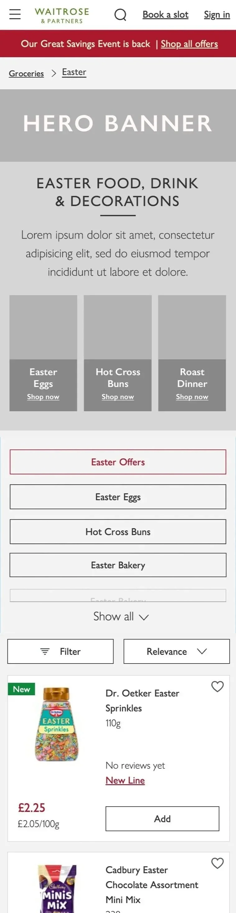
Working with the online trading optimisation specialists, we ran a test on repositioning the navigation buttons. Originally, these were located directly under the page title, before the introduction and seasonal content. As navigation buttons consistently attracted high engagement due to their efficiency, they often drew clicks away from the rest of the content. The test repositioned them lower on the page to encourage customers to engage with seasonal features first. The goal was to expose users to more inspiration and aisles, which we hypothesised would increase product discovery and ultimately drive more add-to-basket actions.
Low-fidelity Wireframes
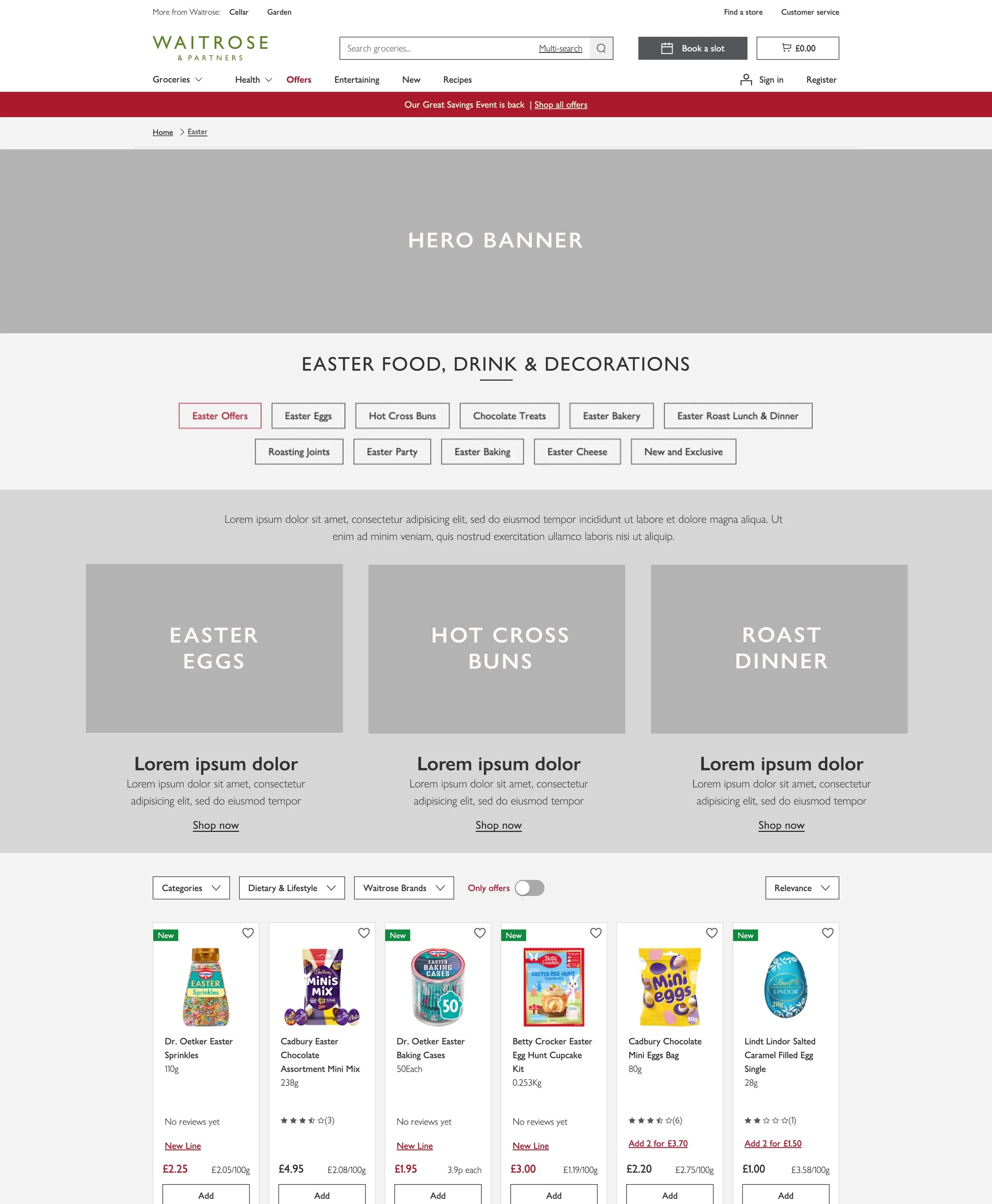
Control: Navigation buttons above seasonal content

Variant: Navigation buttons below seasonal content
When it came to the visual design of the Easter landing page, the first idea explored was using photography in the hero banner to highlight the unique products that were a part of the range.
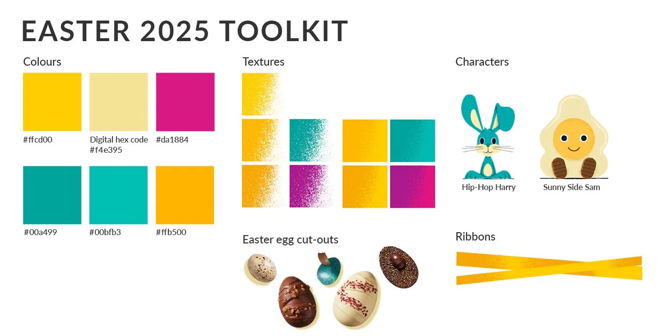
It became apparent that the bright yellow in the toolkit wouldn’t work as a background. It clashed with the
low-fidelity elements, so a lighter shade of yellow was used to avoid visual fatigue.
Photography Iterations
1.1 Photography in the hero banner features the Flat Easter Eggs to spotlight the unique product range, but legibility issues with the title ruled out the use of this image.
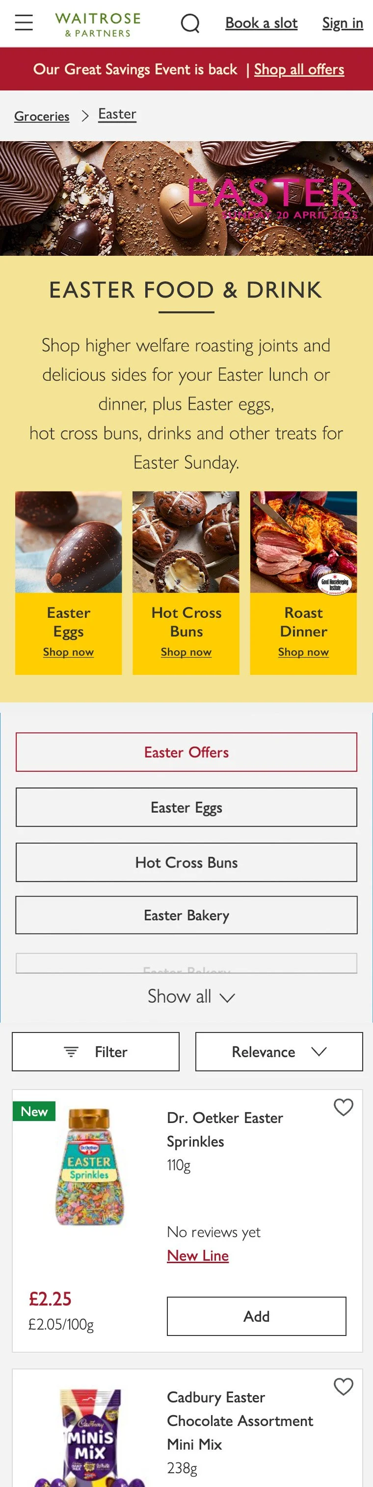
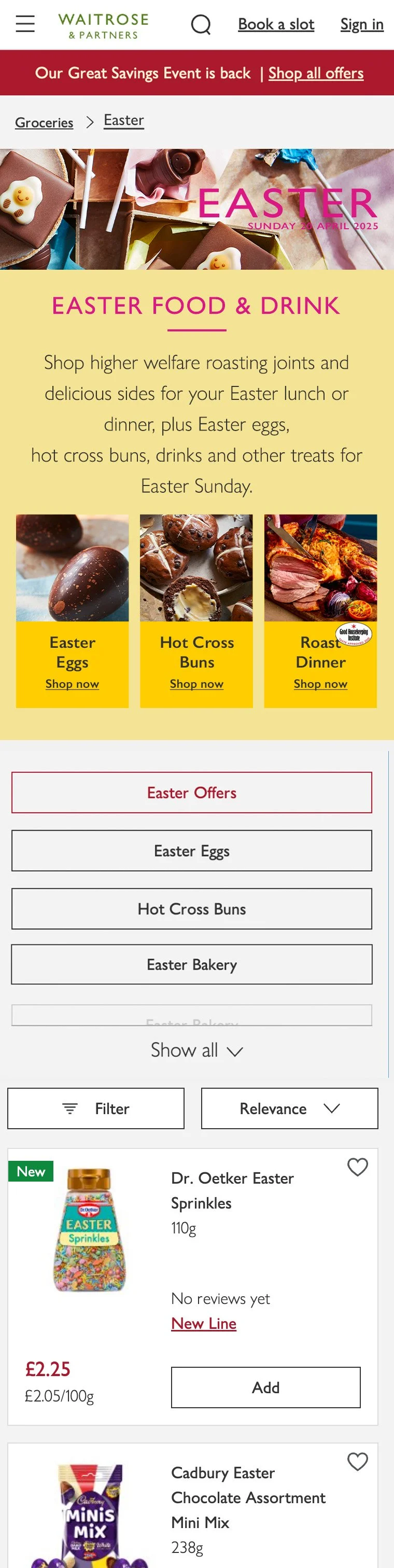
For mobile, copy was reduced to generic headings to provide direct messaging while aiming to get as much content above the fold as possible. A colour copy block was applied behind the headings for mobile to make the pods distinctive on smaller screens.
1.2 Replaced the hero image to improve title readability and align with the toolkit by featuring Sunny Side Sam. Added a bit more colour to the page by making the title pink, which ties in with the hero. It stands out against the yellow and also incorporates more of the colours featured in the easter toolkit.
I liked how the imagery provided a preview of the unique product range, so I included more of the toolkit in the design to align it further with the design of the seasonal campaign by incorporating elements such as ribbons, colour, and texture.
Hybrid: Photography and Toolkit Iterations
1.3 I liked how the pink title stood out against the yellow in design 1.2 so I extended its use to unify headings and enhance visual consistency. Pink headings couldn’t be used on mobile as it couldn’t be applied to copy below 18 pixels, as it wouldn’t meet accessibility standards.
Main focus is on the imagery, but the ribbons are introduced to subtly echo toolkit elements without overstimulating the design.
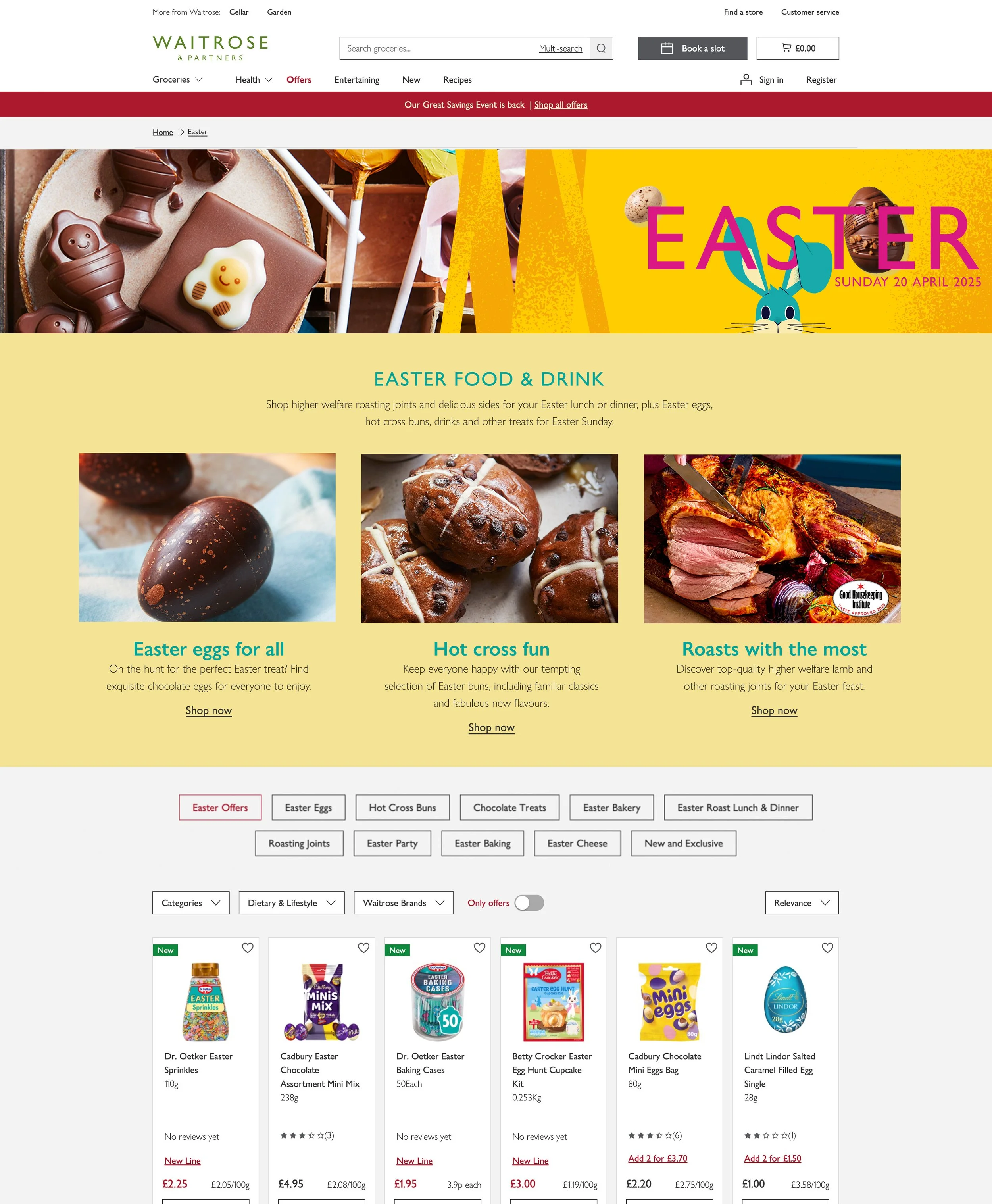
1.4 Incorporated more toolkit components such as Hip-Hop Harry, ribbons and cut-out eggs for a 50/50 photo-to-toolkit layout. Adding these components aligns with point of sale designs (also known as POS, which refers to in-store design fixtures) as they heavily feature these elements.
The title in the hero banner became more legible as the 50/50 split between the image and toolkit provided a backdrop for the title. However, the blue headings lacked sufficient contrast and did not meet accessibility standards despite aligning with the rabbit.
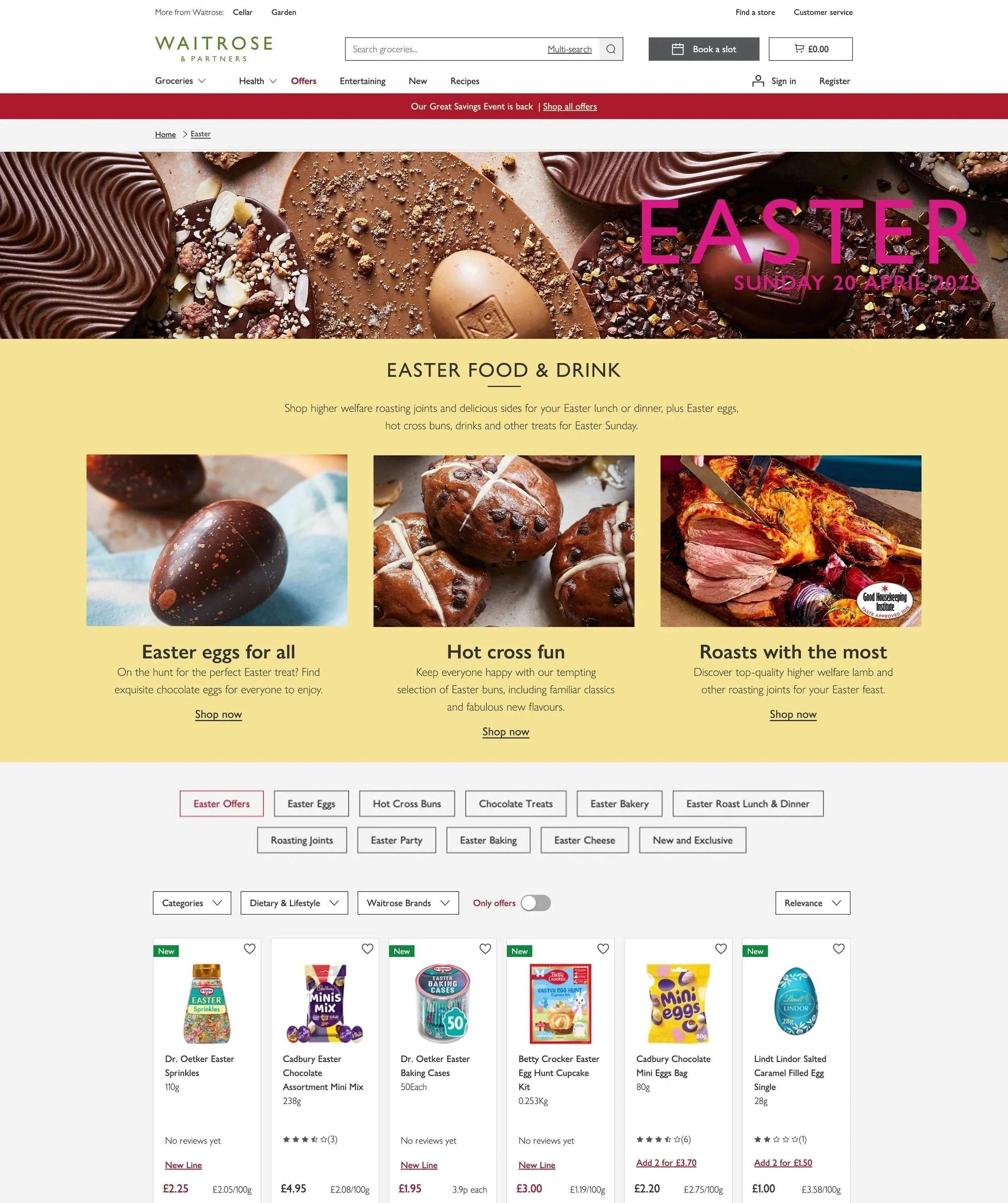
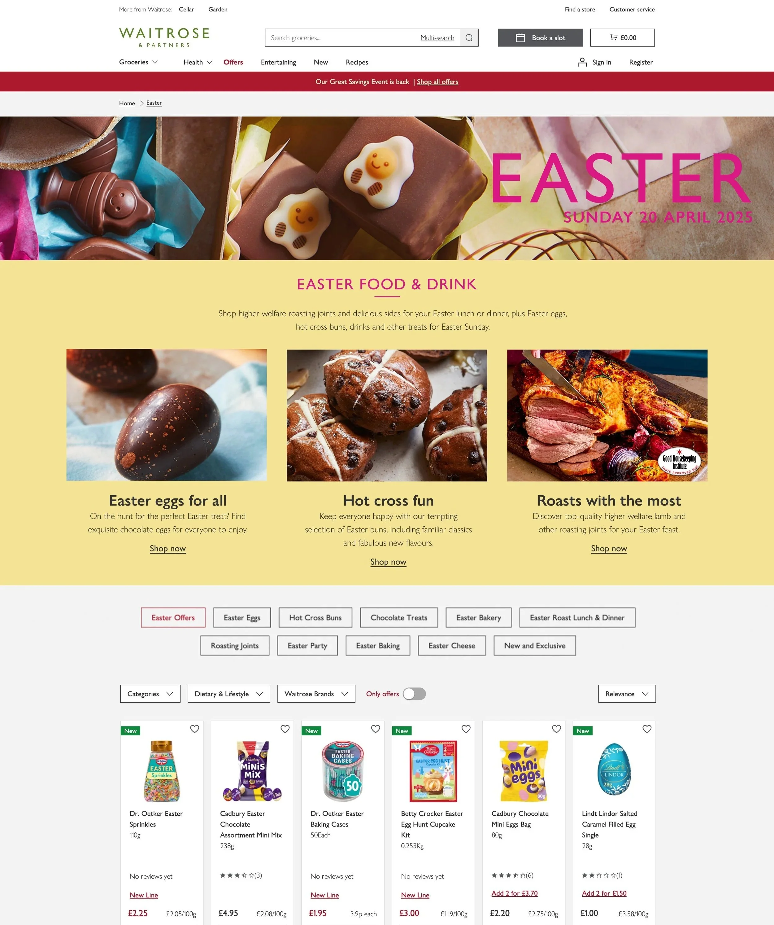
These design iterations fully align with seasonal campaign toolkit by only using elements seen in POS (in-store design fixtures). This consisted of including ribbons, textures, cut-outs, characters and more of the toolkit colours in my design development.
Toolkit Iterations
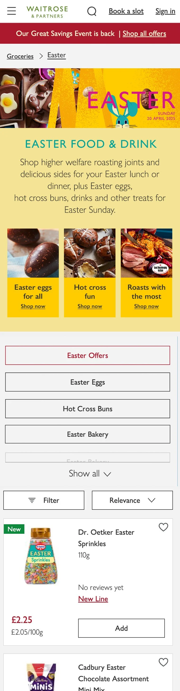
1.5 Imagery has been removed from the hero banner, which now features seasonal campaign elements. Adjusted Easter Sunday placement as this design allows for the date and title to be more distinctive. Added colour copy blocks to mirror mobile design and maintain cohesion through pink accents and structure.


1.6 Reintroduced the rabbit to further the alignment of the design to the toolkit. Used blue for the copy blocks at a larger scale to overcome the initial accessibility issue shown in design 1.4. The blue also unified the different blue elements of the design. On desktop, copy blocks looked bulky and overpowered the layout, leading to it not being included in the final design.
The final design has different elements that I liked and picked from the many iterations I developed. There was a split decision between the hero banners featured in design 1.4 and 1.6. In the end, 1.6 was selected as it aligned the most with POS and made the customer journey between in-store and online more unified.
Final Outcome
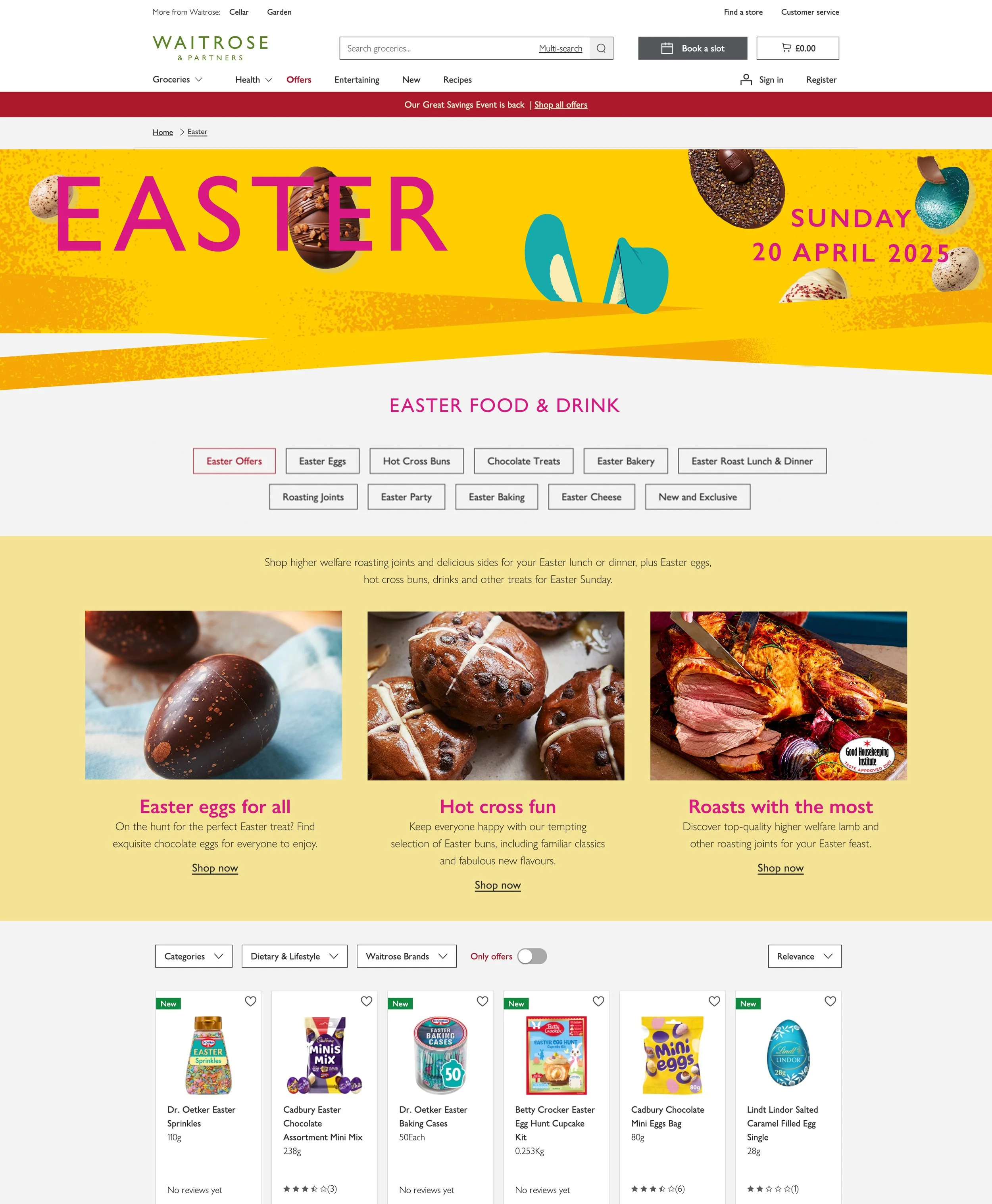
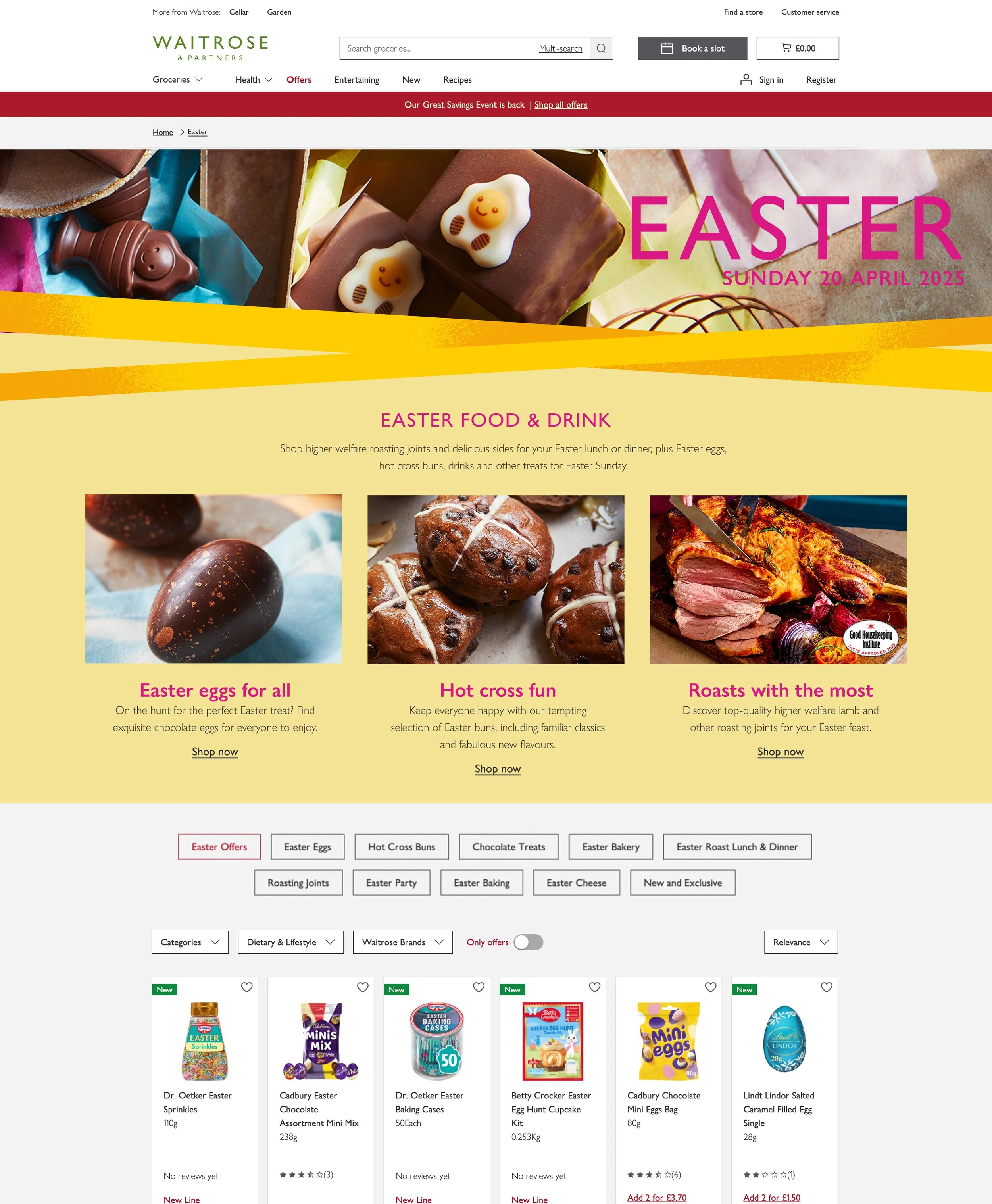
Control: Navigation buttons above seasonal content
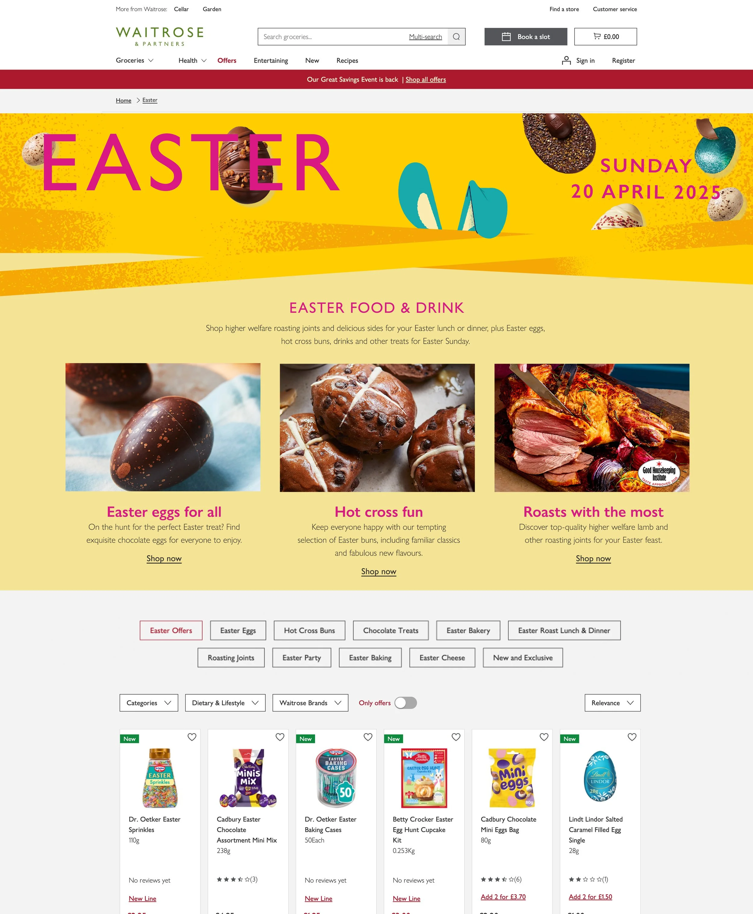
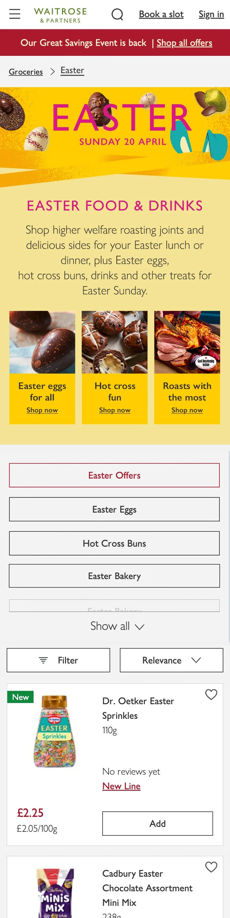
Variant: Navigation buttons below seasonal content
The A/B test ran for two weeks during 2-month course of the Easter campaign, with 50% of visitors shown the variant design. The variant outperformed the control, driving stronger engagement with seasonal content and greater product discovery. For example, the Roast with the Most section achieved an 8% click-through rate in the variant, compared to 5.3% in the control. This is also more than double the performance of the same section in the previous year.
The results highlighted an important insight: while efficient navigation is critical to customer experience, surfacing it too early can limit exploration. By repositioning navigation further down the page, customers engaged more with seasonal content, which led to a 3.2% increase in add-to-baskets.
Once this insight was provided, the variant was shown to 100% of customers as it aligned with user needs and met commercial goals, which resulted in the page achieving an 84% engagement rate (up from 71% the previous year), contributing to the hero product, the British lamb, selling out almost entirely.