Easter Email Design Process
Getting to the final Easter email design was a process of analysing past performance data and refining towards a solution that balanced accessibility, storytelling, and CRM targets. Emails remain one of the few direct ways to reach millions of Waitrose customers, but in an inbox crowded with competing messages, the main challenge is earning attention and driving engagement. The iterations I explored showcase the different approaches I took to overcome this challenge and guide customers towards meaningful interaction with the campaign.

Wireframes
2024 Easter email design
This is the Easter email that went out as part of last year’s campaign, created by a colleague who led the campaign.
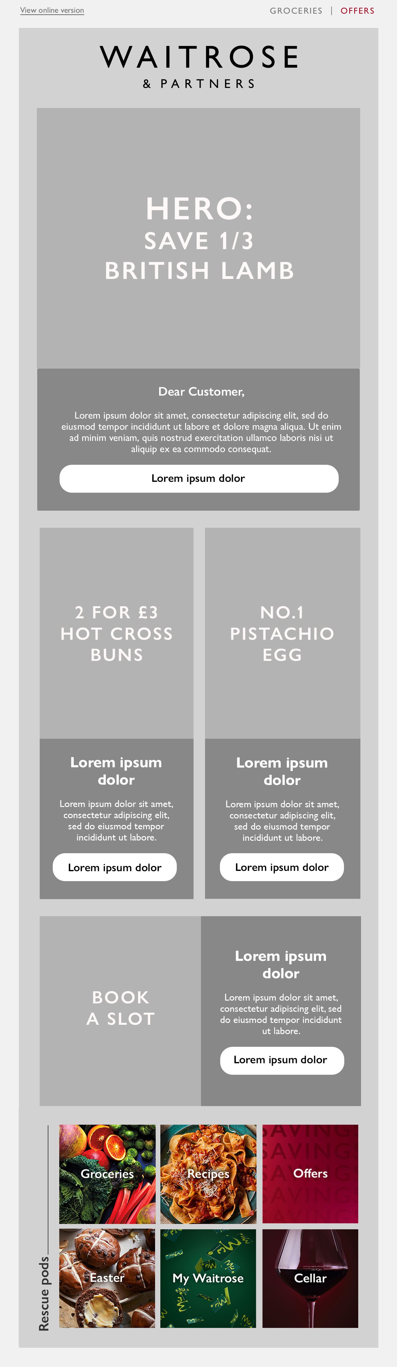
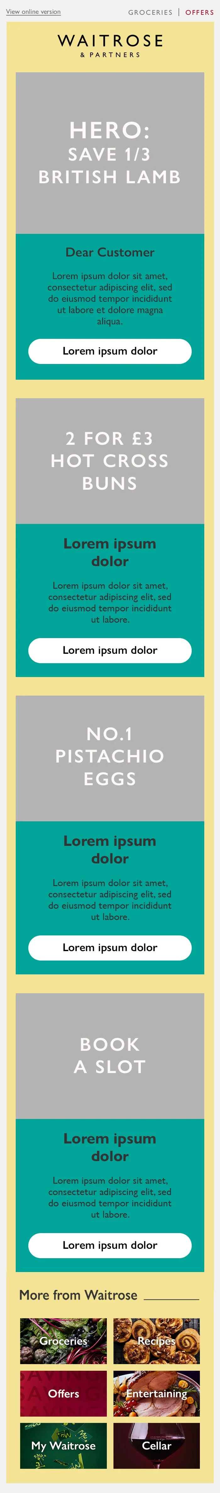
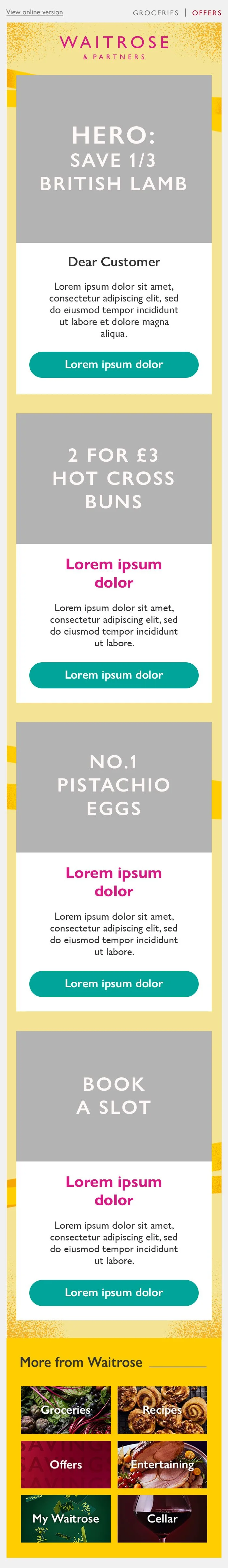
Low-fidelity wireframe
Since last year, the email template has been refreshed with rounder CTAs, updated rescue pods, and improved spacing, while still keeping the toolkit design approach. This has improved the design by creating a more modern and inviting experience.
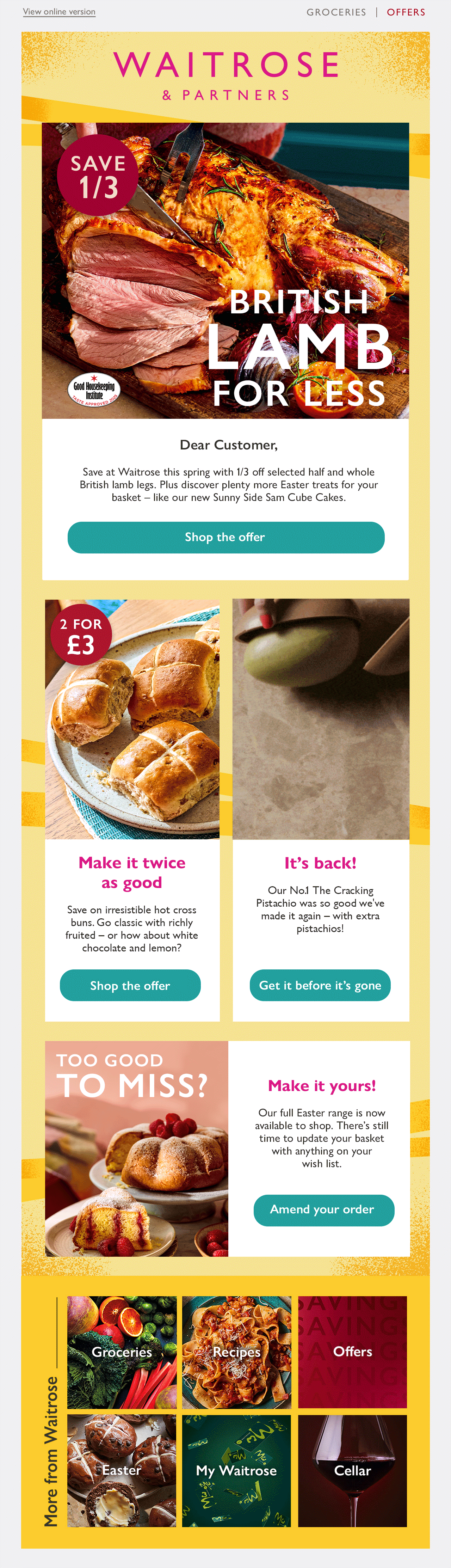
The wireframe outlines the contents of the email based on what the CRM team requested. The hero of the email features the British Roast Lamb offer, the headlining product for this campaign. Following the hero is a 2-column pod platforming the hot cross buns and the No.1 Pistachio Egg. Then there’s a pod requesting customers to book a slot to receive their Easter orders, and rescue pods that allow customers to explore different areas of the website.

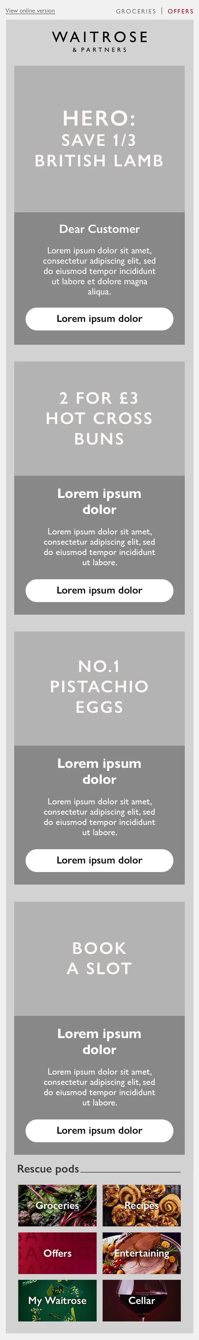
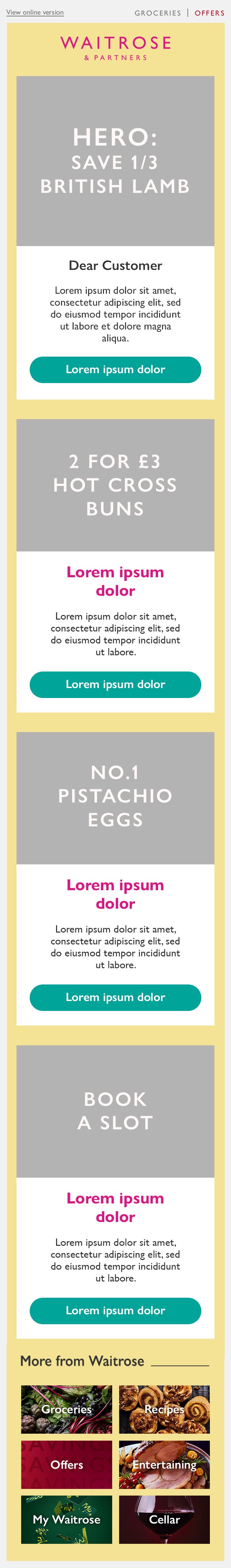
1.1 Bright yellow background aligns with the toolkit. Used blue for the pods in this design to avoid creating a subconscious gender bias by using pink in large quantities. Ideally would have liked to use pink for the CTA buttons, but it didn’t meet accessibility standards.
1.2 The bright yellow background in the previous email was visually jarring and clashed with the other coloured elements of the design. Although this background colour complements the blue copy blocks more in this design, the black copy darkens the ambience of the design. Against the blue, black copy had to be used to meet accessibility standards.
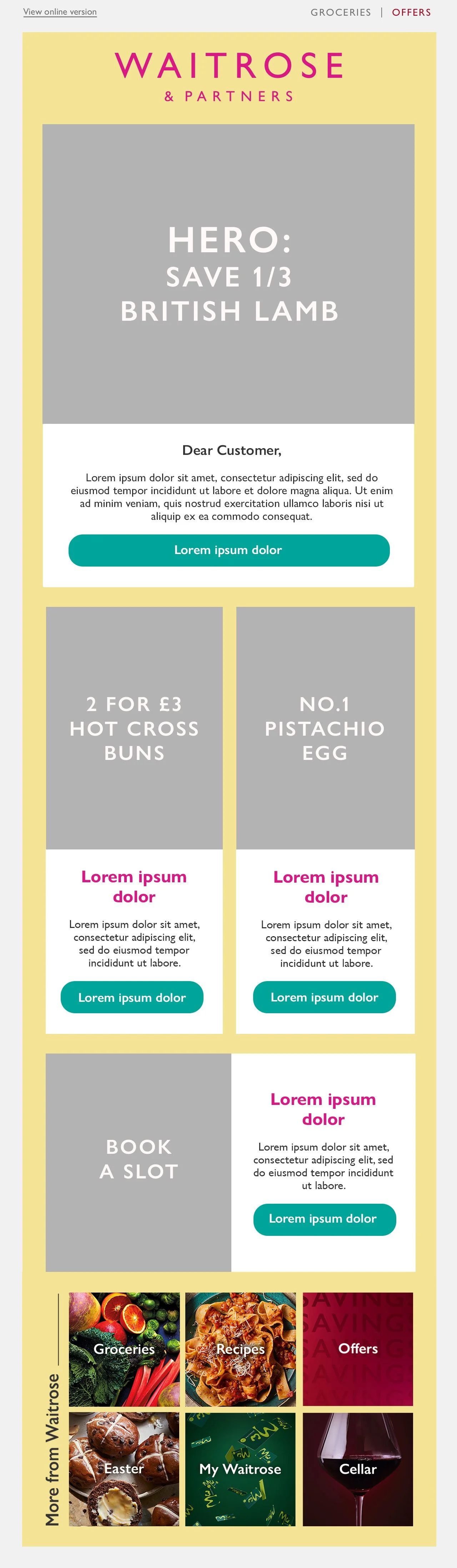
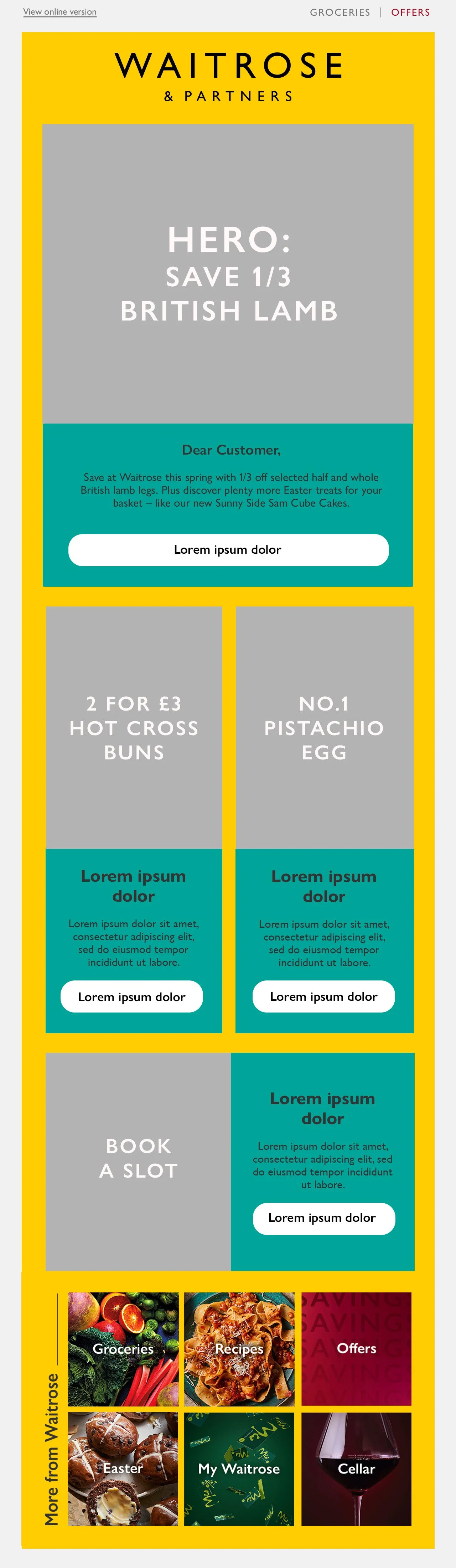
1.3 Developed design 1.2 by lightening the design with the introduction of more white and pink. The pink played a role in brightening the overall appearance by bringing a bright pop of colour to the design, while creating another layer of connection to the toolkit. The blue has been reduced to CTA buttons, complementing the yellow and pink without making the design look heavy. The overall appearance of this iteration is lighter and brighter, fulfilling the connotations of spring and easter.
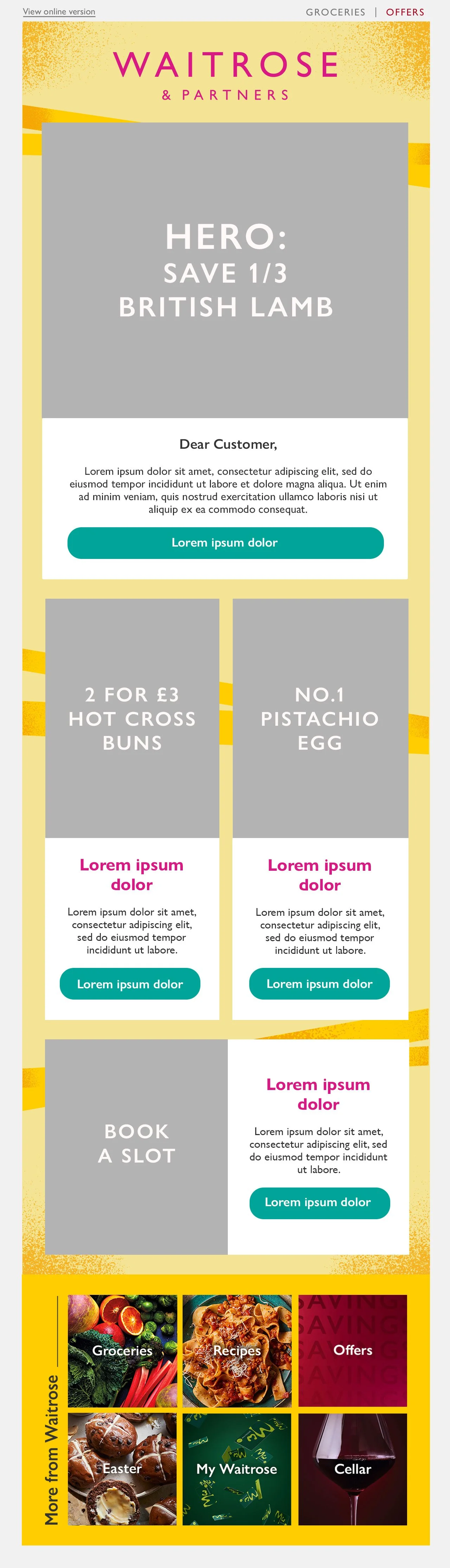
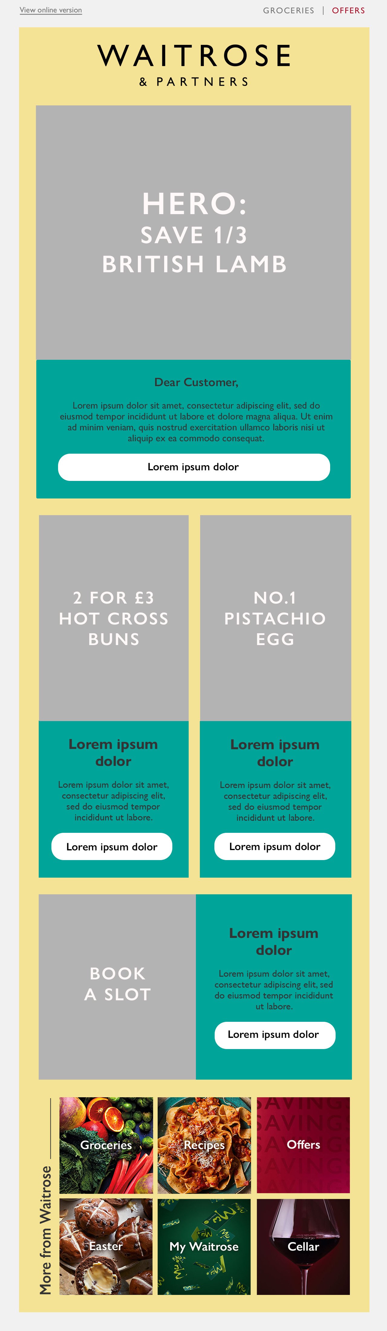
1.4 The lighter and brighter appearance of design 1.3 moved the email design in the correct direction, and was therefore explored further by introducing more elements of the toolkit, such as the ribbons running across the email and the bright yellow textures in the corners. The addition of bright yellow accents within the email further aligns the email to the toolkit without causing visual fatigue.
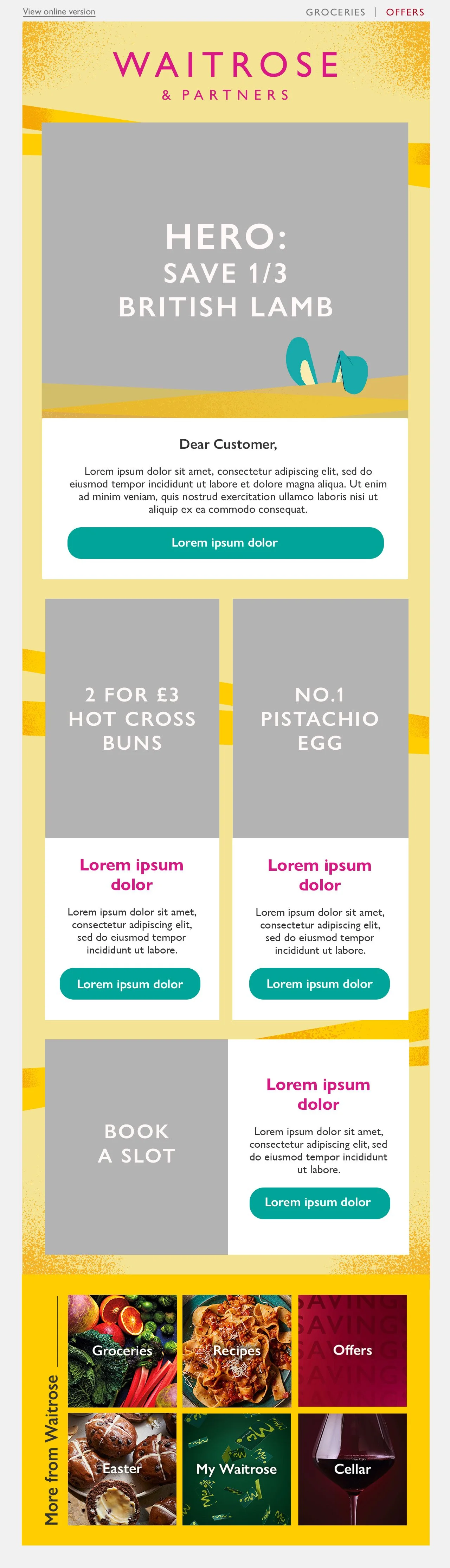

1.5 Took design 1.4 further by including more aspects of the seasonal toolkit. Adding Hip-Hop Harry’s ears and ribbons to the hero harmonises the design between instore fixtures and digital touchpoints, as these elements are promient instore and online.
Incorporating the bunny ears into the hero provides an opportunity for movement by making the ears twitch, in an aim to capture the attention of customers and increase engagement. This approach is an attempt to tackle the main challenge faced with sending emails.
High-Fidelity designs
1.5.1 At mid-fidelity level, design 1.5 initially seemed the strongest. It visually matched the essence of Spring and aligned with the toolkit as it included many prominent elements seen across digital touchpoints and in-store.
After placing the copy and imagery into the email, a majority of the email harmonised with the design apart from the hero. It appeared overwhelming with the different components, such as the offer roundel, header, ribbons and rabbit ears that even had plans to move. The meat being in close proximity to the rabbit ears could also portray morbid imagery, which had to be avoided.
Final Outcome
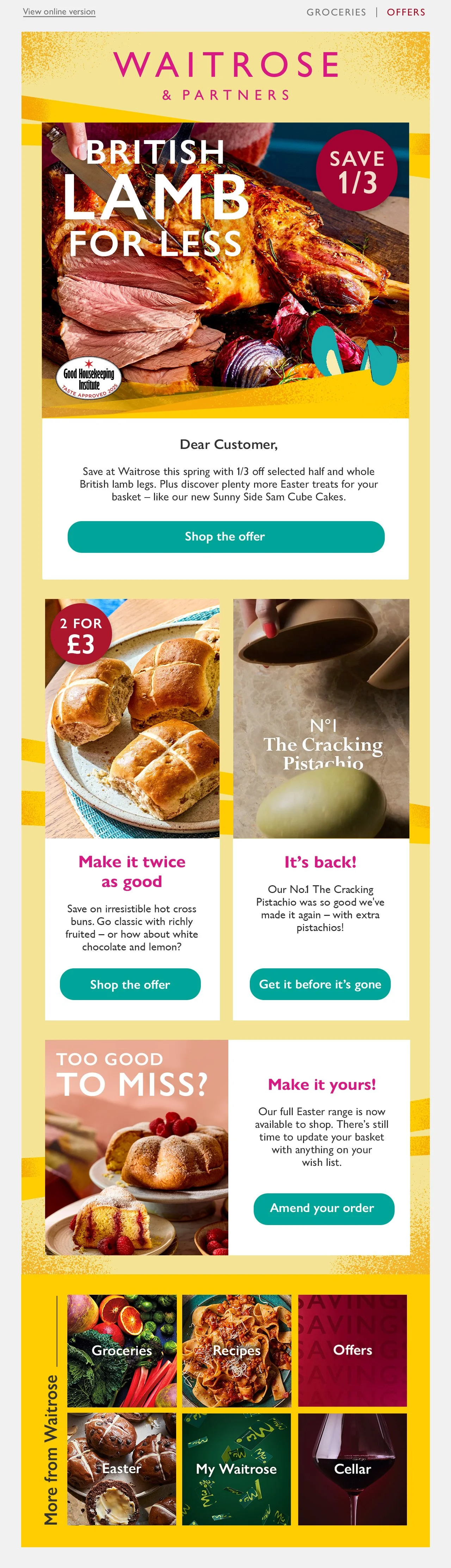
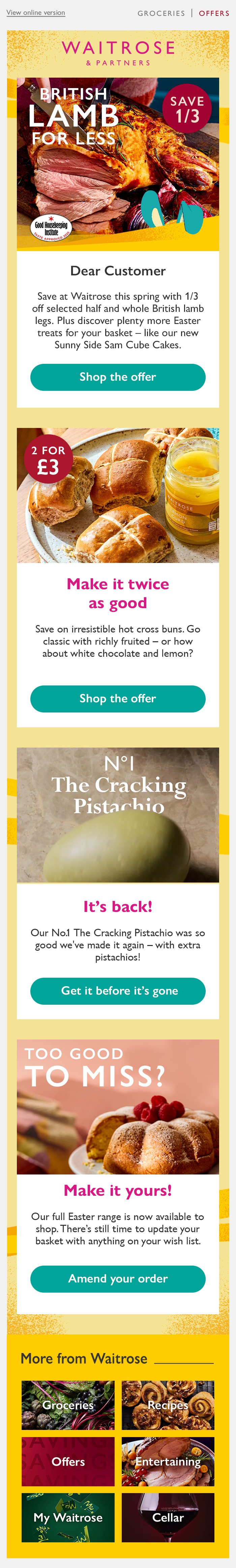
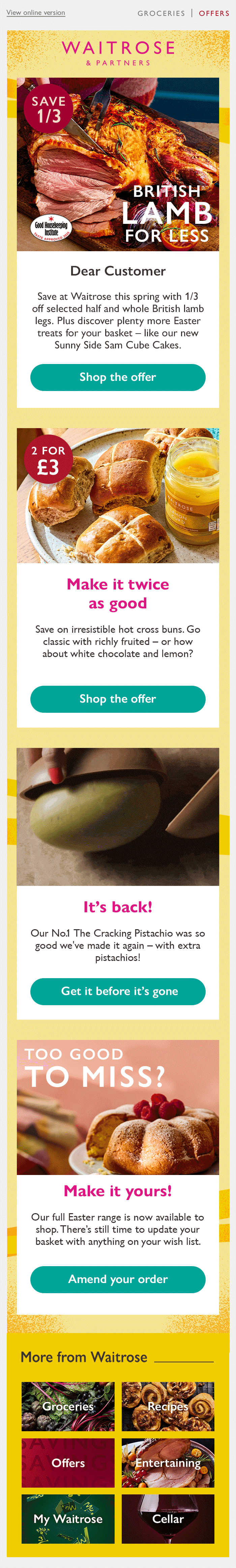
Design 1.5.1 was reverted to 1.4 by removing the additional design elements in the hero. This provided more space for the components required to work seamlessly without clashing, making the overall design look less chaotic.
The removal of the bunny ears meant no opportunity for movement to be used in the hero. However, the concept of using motion to capture customer attention and encourage engagement wasn’t completely lost, as the No.1 Pistachio Egg pod highlights the product as an animation.
Based of on this design, 4 different versions of the email were required as they would be personalised based on a customer’s order history and dietary requirements. For example, vegetarians were shown a roast offer in the hero that didn’t feature any meat, and for customers who had recently shopped the No.1 Pistachio Egg, they were shown the No.1 Flat Egg to encourage product discovery and add to baskets. These were all factors that contributed to the success of the email as it achieved a 4.34% click-through rate, a significant jump from the year before due to the email’s user-centric experience.